# matplotlib.pyplot.bar の概要
matplotlib には、棒グラフを描画するメソッドとして、matplotlib.pyplot.barが用意されてます。
# matplotlib.pyplot.bar の使い方
matplotlib.pyplot.bar(left, height, width=0.8, bottom=None, hold=None,data=None, **kwargs)
| left (必須) | 各棒の X 軸上の数値 |
| height (必須) | 各棒の高さ |
| width | 棒の太さ (デフォルト値: 0.8) |
| bottom | 各棒の下側の余白。(主に積み上げ棒グラフを出力するために使います) |
| color | 棒の色。 |
| edgecolor | 棒の枠線の色 |
| linewidth | 棒の枠線の太さ。 |
| tick_label | X 軸のラベル |
| xerr | X 軸方向のエラーバー (誤差範囲) を出力する場合、数値または配列を指定。 |
| yerr | Y 軸方向のエラーバー (誤差範囲) を出力する場合、数値または配列を指定。 |
| ecolor | エラーバーの色を値または配列で指定。 |
| capsize | エラーバーの傘のサイズを指定。 |
| align | 棒の位置。’edge’ (垂直方向の場合:左端, 水平方向の場合:下端) または ‘center’ (中央)を指定。 (デフォルト値: ‘edge’ ) |
| log | True に設定すると、対数目盛で出力します。 (デフォルト値: False) |
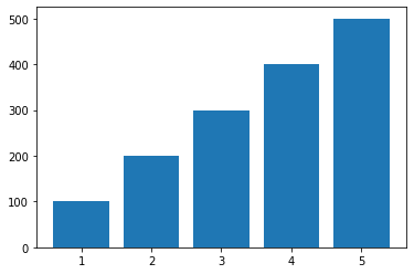
# 基本的な棒グラフの出力例
# 5 本の棒を出力
import numpy as np
import matplotlib.pyplot as plt

left = np.array([1, 2, 3, 4, 5])
height = np.array([100, 200, 300, 400, 500])
plt.bar(left, height)
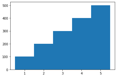
# 幅=1.0に設定 (=棒と棒の隙間を表示しない)
import numpy as np
import matplotlib.pyplot as plt

left = np.array([1, 2, 3, 4, 5])
height = np.array([100, 200, 300, 400, 500])
plt.bar(left, height, width=1.0)
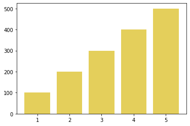
# 棒の色を緑色 (#E4CF5B) に設定し、枠線を非表示
import numpy as np
import matplotlib.pyplot as plt

left = np.array([1, 2, 3, 4, 5])
height = np.array([100, 200, 300, 400, 500])
plt.bar(left, height, color="#E4CF5B", linewidth=0)
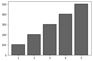
# 棒の色、枠線の色、太さを設定
import numpy as np
import matplotlib.pyplot as plt

left = np.array([1, 2, 3, 4, 5])
height = np.array([100, 200, 300, 400, 500])
plt.bar(left, height, color="#646464", edgecolor="#535353", linewidth=4)
# 棒の位置を中央に設定
import numpy as np
import matplotlib.pyplot as plt

left = np.array([1, 2, 3, 4, 5])
height = np.array([100, 200, 300, 400, 500])
plt.bar(left, height, align="center")

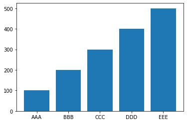
# 横軸に文字列のラベルを指定
import numpy as np
import matplotlib.pyplot as plt

left = np.array([1, 2, 3, 4, 5])
height = np.array([100, 200, 300, 400, 500])
label = ["AAA", "BBB", "CCC", "DDD", "EEE"]
plt.bar(left, height, tick_label=label, align="center")
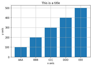
# タイトル、X 軸、Y 軸のラベルを出力
import numpy as np
import matplotlib.pyplot as plt

left = np.array([1, 2, 3, 4, 5])
height = np.array([100, 200, 300, 400, 500])
plt.bar(left, height, tick_label=label, align="center")
plt.title("This is a title")
plt.xlabel("x axis")
plt.ylabel("y axis")
plt.grid(True)
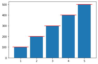
# エラーバー (誤差範囲) を表示する
# X 軸方向のエラーバーを一律 0.5 で赤色 (red) で表示
import numpy as np
import matplotlib.pyplot as plt

left = np.array([1, 2, 3, 4, 5])
height = np.array([100, 200, 300, 400, 500])
plt.bar(left, height, xerr=0.5, ecolor="red")
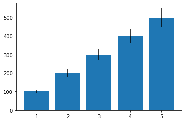
# Y 軸方向のエラーバーを黒色 (black) で表示
import numpy as np
import matplotlib.pyplot as plt

left = np.array([1, 2, 3, 4, 5])
height = np.array([100, 200, 300, 400, 500])
yerr = np.array([10, 20, 30, 40, 50])
plt.bar(left, height, yerr=yerr, ecolor="black")
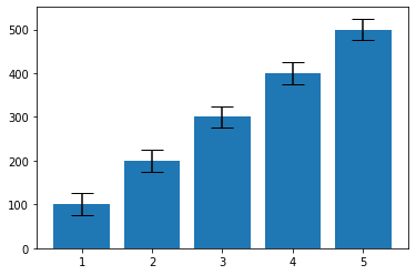
# Y 軸方向のエラーバーを傘のサイズ 10 で表示
import numpy as np
import matplotlib.pyplot as plt

left = np.array([1, 2, 3, 4, 5])
height = np.array([100, 200, 300, 400, 500])
plt.bar(left, height, yerr=25, ecolor="black", capsize=10)
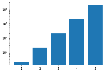
# Y 軸を対数目盛で表示
import numpy as np
import matplotlib.pyplot as plt

left = np.array([1, 2, 3, 4, 5])
height = np.array([200, 2000, 20000, 200000, 2000000])
plt.bar(left,height, log=True)
コリPy
@taida_python
奈良
Python好きの個人開発者。プログラミング3年生。Pythonを現在学習中。日々、アウトプットするためにTwitterはじめました。